Map of the Month: Grand Canyon Uranium Mining

Map of the Month: meet the nerd behind the Trust maps for an insider glimpse into the world of cartography in this monthly blog series.

Stephanie Smith by Stephanie Smith, GIS Director

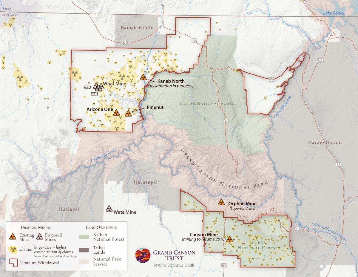
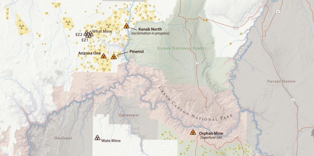
Not long after my arrival at the Trust, I was asked to create a map of all the uranium claims and mines surrounding Grand Canyon National Park.

Without hesitation I said, “sure, absolutely,” without pondering the gravity of such a request. It didn’t take long for my brain to catch up.

Scratching my head in confusion, I asked: “What do you mean uranium mining at the Grand Canyon?”

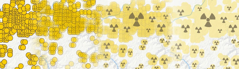
As I began to layer the existing mines, proposed mines, and thousands of uranium claims on the map (with the help of data collected and compiled by the Environmental Working Group), I realized I, like many people, had naively assumed that this breathtaking landscape was protected from such risk.

Looking at the map, I was struck by the proximity of mines to the north and south rims of the park—including an abandoned mine within the park boundary, and dumbfounded by the sheer number of claims across the landscape. For some, this reality comes as no surprise, but it forever changed how I view the “protection” of our public lands.

Uranium Claims Map

Blog - Map of the Month Uranium text 2

While the 2012 uranium withdrawal bans new claims for the next twenty years, existing mines within the withdrawal area continue to shut down and re-open at will, as uranium prices fluctuate. What will happen when the ban on new uranium claims around the Grand Canyon expires in 2032? As existing mines –like Canyon Mine just south of the Grand Canyon, in the Kaibab National Forest, which resumed sinking shaft this year—re-open, this map will continue to evolve.

As a cartographer, the sheer volume of claims presented a challenge. With claim density as high as 30+ per square mile, how could I display each individual claim impactfully without making the map feel cluttered and distracting to the reader? At the size of a tennis court, this would have been no problem, but at 8.5x11, the map first looked like stacks of golden pancakes.

Design Evolution: From Yellow Pancakes to Radiation Symbols

With a few design tricks and by amalgamating the claims into radioactive symbols of varying sizes to show the concentration of claims, I was able to achieve a visually appealing story of uranium around Grand Canyon National Park.

You will find many editions of this map throughout our website. 

Learn more about uranium mining near the Grand Canyon › 

GIS - CTA

Learn more about our GIS Program

Map of the Month

12/23/24

As 2024 draws to a close, we look back at five maps we created this year that give us hope for 2025.

Read More
10/1/24

Four of the five most dangerous sections of the haul route are on the Navajo Nation.

Read More
09/28/22

Pronghorn and barbed wire fences don't mix, but volunteers are working to change that, one wire at a time.

Read More